

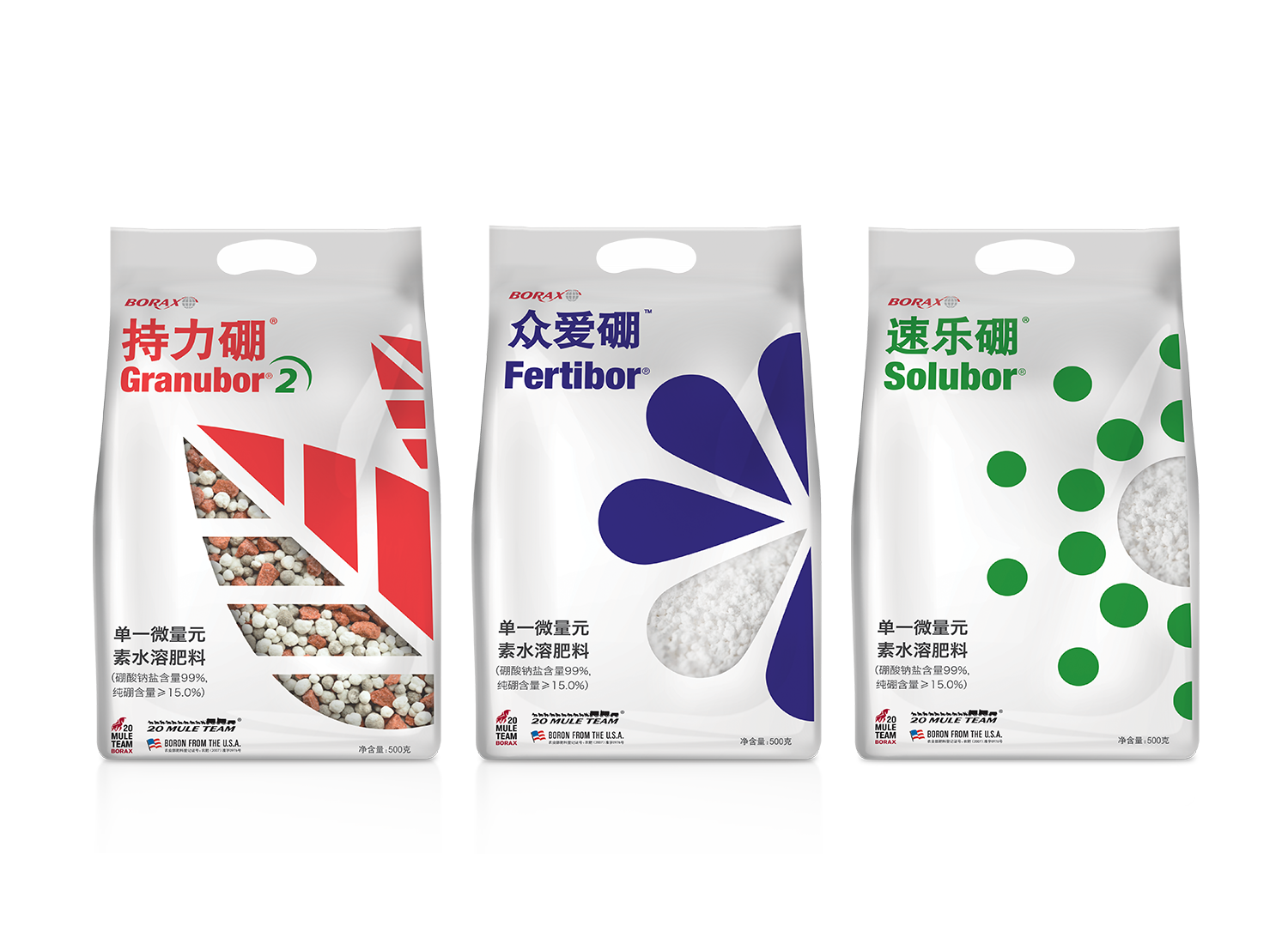
Rio Tinto is one of the world's largest metals and mining corporations. In this project, I have been tasked to re-brand their range of fertilisers for the China market. Our target audience are mainly farmers.
The idea was simple; I wanted a clear distinction between each range of fertilisers, at the same time, I wanted to clean up the fuzziness from the previous packaging giving simple pictograms as graphic representations for clarity.